Google UI Faux Pas, or “How to show love, Hillbilly-style”
Executive Summary: Google doesn’t always get things right.
To make my transformation from Microsoft lackey to Google stooge complete, BookedIN is going to Google IO this year. And thanks to developer extraordinaire, Philippe Beaudoin, we’ve even got a spot on the developer sandbox. Kind of odd that after all my years in .NET, the first time I’ll meet anyone from JetBrains is at a Google conference. Which is good because now I can go to their booth every ten minutes and ask if they’ve finished TeamCity 6.5 yet. (Note to the JetBrains booth babes: If you’re thinking of thwarting my plan by releasing 6.5 before IO, I have a backup plan: My own personal list of feature requests.)
So I’m showing my gratitude to Google by talking about some recent changes to their Google Apps and their forums and, in particular, how much they suck. This isn’t me being all wishy-washy “well, maybe I’m doing something wrong” or “I’m sure they have their reasons”. I feel so strongly that there’s something seriously wrong with what Google’s done to the UI here, that I’m willing to bore each and every one of you about it.
The first change: Google Apps accounts are now being transitioned into a sort of single sign-on thing whereby users can use their accounts to access more Google services. Sometime this year, everyone will be transitioned whether they want to or not. And it means for many services, you can use your Google Apps account to access a bunch of services rather than having to create a generic Google account (i.e. one with @gmail.com).
I’ve been running my family’s email, calendar, roadkill recipe site, etc, on Google Apps for some years now and have no complaints. So I transitioned my own account early. I was minorly distressed by the note saying I have one conflicting user. Not because of the conflict, mind you, but because they give no indication who the user in conflict is. I mean, this is my family. If one of them is in conflict, I feel it is my Deity-given right to butt in and make a mess of things for that person. But alas, all I know is only that someone in my family is conflicted. Good luck narrowing that down.
But that’s not what I came here to complain about.
At my startup, we also use Google Apps. In addition, we use AppEngine, GWT, and Rietveld, all awesome tools and all wanting to know who you are to varying degrees. At this point, I shall point out that all of these tools (including the email management piece) are free, or close enough to it that this whole post could come across as ungrateful. You’re probably right but I wouldn’t be a software developer if I didn’t come with a healthy dose of self-entitlement.
Rietveld, so far, has been a nice citizen. I’ve had no issue with it. Install is almost non-existent through the Google Apps console. Logging in and out plays nice with other Google Apps. Once again, I can not  recommend this tool enough. It’s free. It works for SVN, Git, and Hg. If you use Google Apps, it installs easily for private codebases (not just OSS). Let me pause for a moment and step out of character so as to give weight to my next statement:
Use it.
Then there’s AppEngine. I often have to access the AppEngine console. And I do that with my company email address. But my email session is almost always using my personal email address. If I log into the AppEngine console from the generic login page (see right), inevitably I will be signed out of my email.
This was annoying until I discovered a workaround. Always sign into Google AppEngine using the URL: http://appengine.google.com/a/<domain name>. This gives a slightly different login page (at left). Both pages take you to the same place but the second one has the advantage of leaving the rest of my Google apps alone.
Google Forums
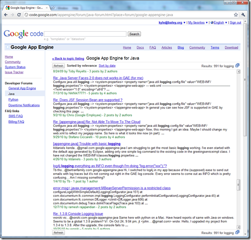
Because there’s a workaround, this doesn’t annoy me too much. The faux pas that led to this post happened when I tried to access either the GWT or the AppEngine forums. Once upon a time (i.e. a year ago), they were proper Google Groups. Now, they are Google Forums which, as far as I can tell, is the same information but with twice the scrollbars:
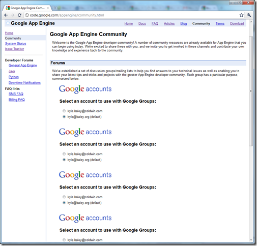
Again, this isn’t the punchline yet. That actually comes when I want to post a question to the forum. AppEngine has several forums and I suppose each one is shown with a different widget initially because when it can’t quite figure out who I am, I’m faced with this:
Screen real estate and my own good sense prevents me from showing the bottom of this page but the important piece of information is: there’s no button on it. I.e. After selecting your account there is no obvious way to tell the page to use it. Instead each widget is showing a Submit button. You have to select the text and drag down to see it. Some HTML magic to hide the internal scrollbars for each DIV, I suspect.
Now even all of this wasn’t enough to sour my mood. All of these images have been sitting in my Humorous Anecdotes folder for a post a lot lighter in tone but still making the underlying point which is: this all sucks. The final UI excrement that had me looking through all of Oren’s posts labelled Code Review for inspiration on how to word things was this:
Kyle the Nested


